Creating custom model outputs with Python
Python step explains the python() pipeline step in more detail, whereas this page will look at a
practical example of creating summary outputs using it.
Before we start
This page is aimed at more advanced users who are already familiar with writing their own pipelines, and want a worked example of using Python to create customized model outputs, such as graphs or even PDF reports.
We expect that you:
Have been through the How to write basic pipelines tutorial.
Have some basic Python knowledge and have Python installed on your computer.
Tip
If you are new to RiskScape and just want to get started with Python right away, we recommend starting off with earlier tutorials first, like Going beyond simple RiskScape models or Python functions. Python is typically used in RiskScape to model loss or damage to an individual asset, which is quite different to what this tutorial covers.
Getting started
Setup
Click here to download the example project we will use in this guide. Unzip the file into the Top-level Windows project directory where you normally keep your RiskScape projects.
This project contains a working example of the building-damage model from the
Getting started modelling in RiskScape guide.
CPython
CPython is what most people consider regular Python. RiskScape supports a python pipeline step that lets you pass the model results directly to Python for further processing.
Note
In order to use the python step, you need to have the Beta plugin enabled and have configured RiskScape to use CPython.
We use a few Python libraries in this tutorial. If you want to follow along, you’ll need to have installed:
pandasgeopandasshapelymatplotlibmarkdown_pdftabulate
Each library can be installed by running pip install <name>, or by using your
system package manager. See python.org
for more help installing libraries.
The Python step
In this tutorial, we’ll work through an example of making a graph, a map, and
finally a PDF report using the python() pipeline step. We will use various CPython libraries
to write the output files.
We will also register the Python output files with RiskScape, so they get
treated like any other RiskScape model output.
The building damage model
Firstly, try running the building damage model ‘as is’ by entering the following command into your terminal:
riskscape model run building-damage
Tip
If the RiskScape command produced an error, try checking that riskscape -V runs OK,
that the current working directory is where you unzipped the example, and that RiskScape is
setup correctly to use CPython.
Open the building-damage-pipeline.txt file in a text editor.
This is the pipeline code that the model uses.
The model uses a Python function to determine the damage to each building from a tsunami event.
This tutorial will look at passing the regional-impact.geojson model results to a python()
step to then transform the data into custom model outputs.
Bar graph
We will start off by using Python to create a simple bar graph.
Append the following to the bottom of building-damage-pipeline.txt and save the file.
summary
 -> python('plot.py')
This passes the model results that are coming out of the ‘summary’ pipeline step
to a Python script called plot.py, which creates a basic bar graph.
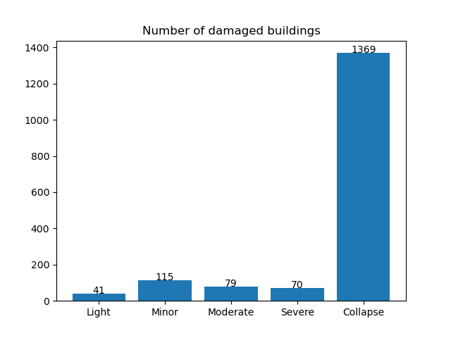
Open the plot.py file in your text editor. It should look like the following:
import pandas as pd
import matplotlib.pyplot as plt

def function(rows):
    # turn the RiskScape input rows into a Pandas dataframe
    df = pd.DataFrame(rows)
    # turn the dataframe into a bar_graph
    bar_graph(df, model_output('building-damage-states.png'))

def bar_graph(df, filename):
    # bar graph plot
    states = ['Light', 'Minor', 'Moderate', 'Severe', 'Collapse']
    total_count = [ sum([ region['count'] for region in df[state] ]) for state in states ]

    plt.bar(states, total_count)
    plt.title('Number of damaged buildings')
    # also add the total count as a label
    for i, y in enumerate(total_count):
        plt.text(i, y, y, ha='center')
    plt.savefig(filename)
This function uses Pandas and Matplotlib to create a simple bar graph.
Enter the following command to run the model again.
riskscape model run building-damage
You should now see an extra line in the list of outputs for a building-damage-states.png file.
If you open that file up, you should see something like this.
Registering model outputs
One important thing that plot.py does happens on the following lines:
# turn the dataframe into a bar_graph
bar_graph(df, model_output('building-damage-states.png'))
The model_output() function is a special Python function provided by RiskScape.
It tells RiskScape that our Python function is writing an output file (called building-damage-states.png).
RiskScape will then make sure the building-damage-states.png file gets saved in
the same directory as all the other model outputs.
Tip
We recommend that you use model_output() whenever you save a file in Python code.
If you don’t, the file will still get written but it might end up in a different directory,
and the model won’t be compatible with the RiskScape Platform.
Choropleth map
Next, let’s add an output that shows our data on a map. GeoPandas is a Python library that allows processing and plotting of geographical data.
Go back to your building-damage-pipeline.txt file and edit the last line so that it
looks like this:
summary
 -> python('choropleth.py')
Save the pipeline file and run the model again.
This now passes the model results to a different Python script (choropleth.py).
The model should now produce a new regional-collapsed-buildings.png output.
It should look something like this:
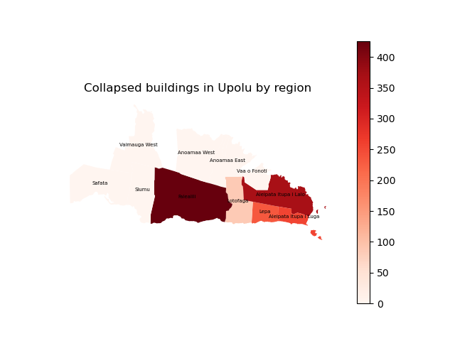
Open the choropleth.py file in your text editor. It should look like this:
import pandas as pd
import matplotlib.pyplot as plt
import geopandas as gpd
from shapely import wkb

def function(rows):
    # turn the RiskScape input into a dataframe
    df = pd.DataFrame(rows)
    # turn the dataframe into a choroplath map
    choropleth_map(df, model_output('regional-collapsed-buildings.png'))

def choropleth_map(df, filename):
    # deserialize the WKB and turn it back into geometry
    geometry = [ wkb.loads(row['the_geom'][0]) for row in df['Region'] ]
    gdf = gpd.GeoDataFrame(df, crs="EPSG:4326", geometry=geometry)

    ax = gdf.plot(column='Collapsed', cmap='Reds', legend=True)
    # labels
    gdf.apply(lambda x: ax.annotate(text=x['Region']['Region'], xy=x.geometry.centroid.coords[0], ha='center', size=5), axis=1)
    ax.set_axis_off()
    ax.set_title('Collapsed buildings in Upolu by region')
    plt.savefig(filename)
This is the Python code that was used to produce the choropleth map.
One thing to note is that RiskScape serializes all the data that it passes
to CPython, so the geometry data gets passed through as a Well-Known Bytes (WKB) Python tuple.
This Python code uses shapely to turn the WKB data back into a geometry Python object.
PDF outputs
You can also use Python to generate PDF outputs. This is useful for generating reports, or even just to collect all your other outputs on a single page for sharing.
Edit the last line in your building-damage-pipeline.txt file so that it
looks like this:
summary
 -> python('pdf.py')
The pdf.py code uses a Python library called
MarkdownPDF to convert markdown text into a PDF document.
Markdown is a simple way to apply styling, such as headings and formatting,
to a plain-text document.
Note
There are many different Python libraries that you can use to create a PDF. We have used MarkdownPDF here because it works well as a simple example.
Save your pipeline file and run the model again.
It should now produce a Report-Summary.pdf PDF output.
Open the PDF file - it should look something like this:
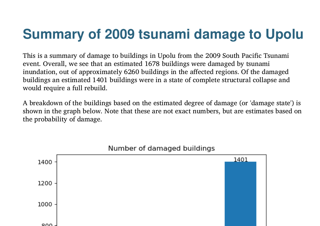
The template markdown for our report is stored in a file called template.md.
Open the file in your preferred text editor and have a look. You’ll notice some
text in curly brackets (braces). The Python pdf.py code is reading this template
file and then swapping out that placeholder text for our actual model results.
Open the pdf.py file in your text editor.
We will walk through what the Python code is doing step by step.
This first part is just importing the Python code from the two earlier examples and generating the plot and choropleth map again.
import pandas as pd
from markdown_pdf import MarkdownPdf, Section
from plot import bar_graph
from choropleth import choropleth_map

def function(rows):
    df = pd.DataFrame(rows)

    # create the .png files from the previous plot/choropleth examples
    bar_graph(df, model_output('building-damage-states.png'))
    choropleth_map(df, model_output('regional-collapsed-buildings.png'))
The next section is just manipulating the Pandas Dataframe to calculate some summary totals, so we will skip over that part. You could alternatively do this work in the RiskScape pipeline instead.
This next part is reading the template.md file and replacing the placeholder
values (in {}s) with the actual results coming out of the model.
# replace the {placeholder} values in the template with the actual results
with open("template.md") as template:
    text = template.read().format(
        total_damaged=total_damaged,
        total_buildings=sum(totals.values()),
        total_collapsed=totals['Collapse']
    )
The next bit appends a table of the regional results to the PDF. Handily, the Pandas Dataframe has a
convenient .to_markdown() method, so we don’t have to make the table ourselves.
# insert the simplified table of results
text += "\n" + table.to_markdown(index=False)
Finally, we pass the markdown string to MarkdownPDF for it to generate our PDF.
pdf = MarkdownPdf()
pdf.add_section(Section(text), user_css=style)
pdf.save(model_output('Report-Summary.pdf'))
Optional PDF Styling
We skipped over one part of the pdf.py code, which applies styling to
the final PDF:
with open("style.css") as file:
    style = file.read()
This is applies CSS to the PDF, which is the same styling used by web pages. In this case, it changes the colour and font of the heading, and applies styling to the table.
With the approach used in this example, markdown supports basic font styling (such as bold and italics), whereas CSS would be used to change other aspects (such as the font type, size, and colour).
Another alternative approach would be to use LaTeX to control the styling when generating a PDF from Python.
Testing your Python code
Running Python manually
When you’re writing your own Python code, it can take quite a long time to test
if you have to run your entire RiskScape model every time.
You can test your Python code manually, outside of the RiskScape model, by using the
if __name__ == '__main__': Python idiom.
Try running the manual.py Python code by using the following command:
python manual.py
This code is the same as the first plot.py example, and produces the same output,
but it can be run manually. Open the manual-test.png file it produced and check the results.
Tip
Running the Python script manually allows you to test changes to your Python code without having to run the entire RiskScape model every time.
In your editor, open the manual.py file and take a look.
The following section at the bottom allows the code to be run manually, outside of RiskScape:
if __name__ == '__main__':
    # note that the results coming out of RiskScape are dict objects
    precanned_results = map(lambda x: { 'count': x }, [41, 115, 79, 70, 1369])
    df = pd.DataFrame(columns=['Light', 'Minor', 'Moderate', 'Severe', 'Collapse'],
                     data=[precanned_results])
    bar_graph(df, 'manual-test.png')
This snippet of code creates a Pandas Dataframe manually, and then calls the plotting code.
Instead of hard-coding the values in the Pandas Dataframe, you could work
with a static results file (for example, generated from running your model once
without the Python step). In your Python file you can load the results
into a DataFrame (i.e. with pandas.read_csv()) and then pass the Dataframe to the function
RiskScape will call.
Note
The shape of the data that RiskScape passes to your Python code might be slightly
different to the data that gets read from a results file. This difference is due to
structs in the model results. An instance of a RiskScape struct gets passed to
Python code as a Python dictionary, e.g. { 'Collapse': { 'count': 123 } }.
Whereas when saving data to a file, any structs get “flattened” and turned into
a column like Collapse.count.
Input data subset
Another alternative to speed up testing your Python code is to simply run the model over a subset of results. Instead of running the model over the entire building dataset, you could limit the model run to the first 50 buildings.
Though you obviously won’t get an accurate result without all the data, the model will run much quicker, meaning you can test changes to your Python code faster.
You could test this out by changing the start of building-damage-pipeline.txt so
that it looks like this:
#input(relation: 'data/Buildings_SE_Upolu.shp', name: 'exposure') as exposures_input
input(relation: 'data/Buildings_SE_Upolu.shp', name: 'exposure', limit: 50) as exposures_input
Now if you run the model again, only the first 50 buildings will be included in the results. Although it does not make a huge difference to the model run-time in this simple example, it can make a big difference if your model is processing millions of assets.
Warning
Just remember to remove the limit from your pipeline code once you are done!
Summary
This tutorial has covered some simple examples of how you can use Python to create customized outputs, such as plots, maps, or even PDF reports, when you run a RiskScape model.
Python is a very flexible language, so potentially anything you could do in Python could be integrated with the RiskScape model run.